When Words and Fonts Work Together
UX writing is more than writing buttons or microcopy—it’s about guiding the user through an experience. But even the clearest text can get lost in poor design. That’s where typography comes in.
Typography is the voice of UX writing. It shapes how people read, feel, and move through a digital product. When done right, typography makes user journeys feel effortless. When done wrong, it turns navigation into a struggle.
This article explores how UX writing and typography work together to enhance user flow—and how you can master both to create delightful, high-performing interfaces.
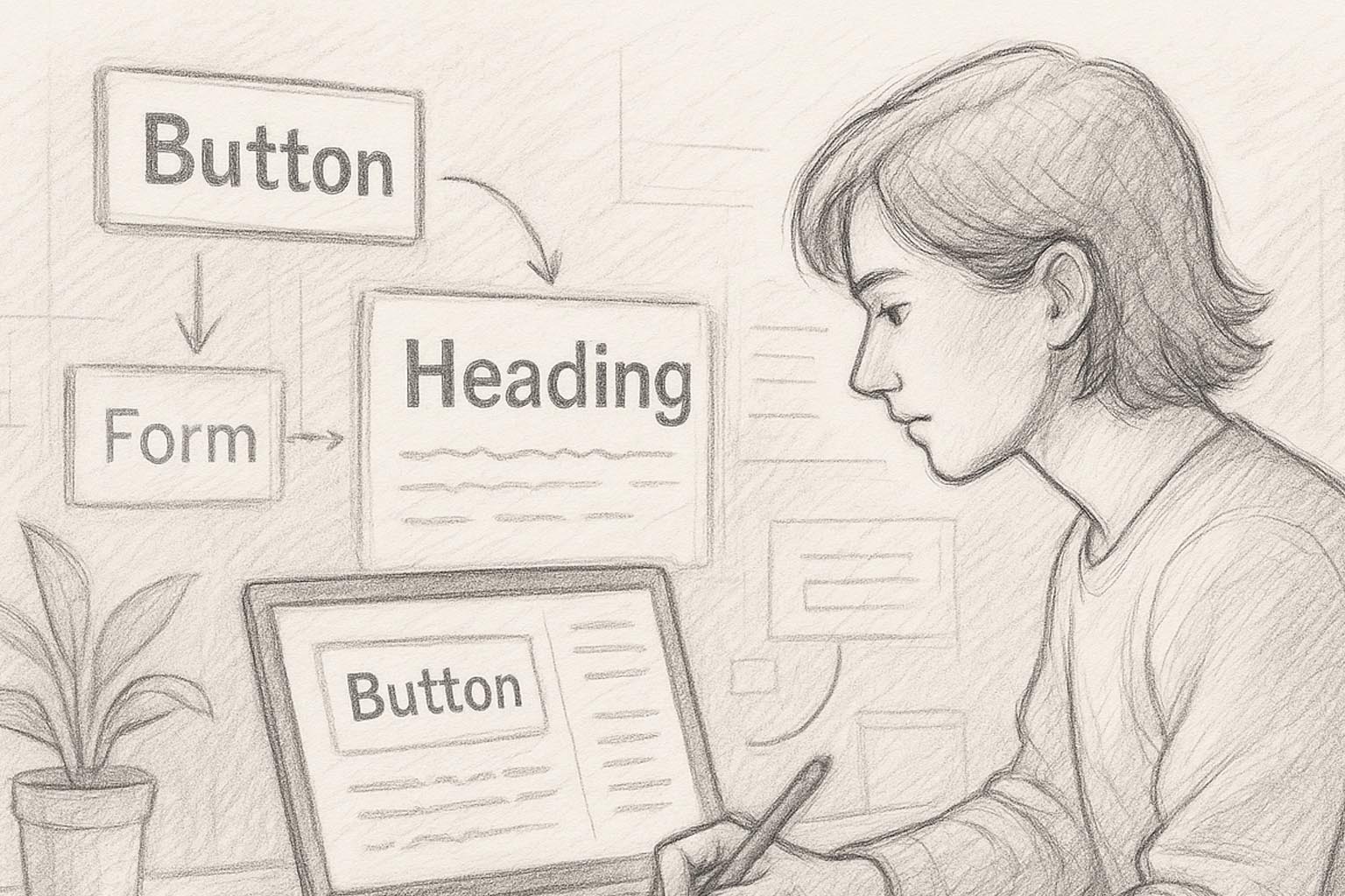
Chapter 1: What Is User Flow?
Before diving into fonts and copy, let’s define user flow.
A user flow is the sequence of actions a user takes to accomplish a task within a product. For example:
- Signing up for an account
- Completing a checkout process
- Booking a ticket
- Uploading a file
Good user flow = Clear direction + Minimal friction
Typography and UX writing are two of the most underestimated tools to make this happen.
Chapter 2: Typography as a Visual Hierarchy Tool
Typography provides visual structure, helping users know:
- What to read first
- What action to take
- Where they are in the process
Let’s look at some key typographic elements that influence user flow:
| Typography Element | UX Impact |
|---|---|
| Font Size | Establishes importance; draws attention to calls-to-action |
| Font Weight | Helps distinguish headlines, labels, and clickable elements |
| Line Height | Improves readability for longer explanations or body copy |
| Color & Contrast | Enhances visibility, accessibility, and user confidence |
| Spacing | Prevents visual clutter and fatigue during interactions |
Together, these elements allow UX writing to breathe, be scannable, and guide action.
Chapter 3: UX Writing Principles Enhanced by Typography
Here’s how good typography amplifies solid UX writing:
1. Clarity
- Don’t just write clear copy—display it clearly.
- Example: “Continue” on a button is great—but not if it’s buried in tiny grey text.
Typography Tip: Use a medium or bold weight for action buttons. Minimum size: 16px.
2. Brevity
- Short copy isn’t helpful if it feels invisible.
Typography Tip: Use whitespace and strategic placement to highlight key words like “Free,” “Now,” or “Secure.”
3. Context
- Help users understand where they are.
Typography Tip: Use font weight and subtle sizing to differentiate steps in a process (e.g., Step 1 / Step 2 / Step 3).
4. Tone of Voice
- Your tone (friendly, serious, playful) should match the font style.
Typography Tip: A rounded sans-serif (like Nunito) feels welcoming. A sharp geometric font (like Futura) feels modern and efficient.
Chapter 4: Font Choices That Support UX Writing
Here’s a breakdown of typefaces commonly used in UX—and why they work:
1. Sans-Serif Fonts
- Examples: Roboto, Open Sans, Lato, Inter
- Why they work: Clean, modern, and readable across all devices
- Best for: Body copy, form labels, mobile screens
2. Geometric Sans-Serif
- Examples: Futura, Montserrat, Circular
- Why they work: Stylish and contemporary; excellent for headers and CTAs
- Best for: Marketing sites, product landing pages
3. Humanist Sans
- Examples: Calibri, Segoe UI
- Why they work: Friendly and highly legible; great for accessibility
- Best for: Apps targeting diverse users or older demographics
Avoid:
- Overly decorative display fonts
- Fonts with narrow spacing
- Script or serif fonts for interactive elements
Chapter 5: Microcopy and Font Styling
Microcopy (think tooltips, labels, error messages) must be fast to read and impossible to miss.
Tips:
- Use italic for emphasis (but sparingly)
- Use bold for high-priority phrases
- Keep error messages red, but ensure it meets contrast ratios
- Never go below 12px font size on any device
- Use consistent font choices across states (e.g., inactive vs active fields)
Example:
✗ “Something went wrong” (small, grey, hard to read)
✓ “⚠ Please check your email format” (bold, red, 14px)
Chapter 6: How Typography Affects Scanning Behavior
Users don’t read. They scan.
UX writing must align with typographic choices that support:
- F-pattern scanning
- Z-pattern flow on mobile
- Quick prioritization of action words
Strategies:
- Use bold headers to group sections
- Place key info in the top-left or center
- Avoid long paragraphs—aim for 2–3 lines max
- Use bullet lists (like this one 😎)
Fonts with high x-height (like Inter or Source Sans Pro) are more scannable than fonts with narrow bodies.
Chapter 7: Accessibility Considerations in Typographic UX
Accessible design = Good UX for all.
Key rules:
- Font size: Minimum 16px for body text
- Contrast ratio: At least 4.5:1 between text and background
- Line height: 1.4–1.6x the font size
- No all-caps body copy—it’s harder to read
- Avoid justified text—it creates uneven spacing
Bonus: Use tools like Stark, Color Oracle, or Google Lighthouse to test accessibility of your typography + writing.
Chapter 8: Typography for Mobile UX Writing
Small screens = higher stakes for readability.
Best Practices:
- Stick to 1–2 font styles
- Use font size scale:
- Header: 24–28px
- Subhead: 18–20px
- Body: 14–16px
- Avoid dense paragraphs—space out microcopy
- Use font that renders well across Android/iOS (like Roboto or SF Pro)
Tip: Preview your copy in real screen size before pushing live.
Chapter 9: Real-World Examples
✅ Slack
- Uses clear, friendly microcopy
- Pairs with bold headers and subtle sans-serif body fonts
- Error messages are visible but never panic-inducing
✅ Google Forms
- Clean Roboto font hierarchy
- Microcopy explains context: “Required,” “Your email address won’t be shared.”
- Clear visual breaks help user flow
❌ Bad UX: Overdesigned Portfolio Sites
- Script fonts for body text
- All-caps menus with no spacing
- Tiny tooltips that vanish too quickly
Typography should guide, not confuse.
Conclusion: Design Words Like a Journey
Typography and UX writing are two halves of the same brain. Together, they shape how users think, feel, and act.
So the next time you write a button, ask yourself:
- Can users read it quickly?
- Does the font choice support the message?
- Is the tone consistent and legible?
Because in UX, great writing is not enough—it must be seen, felt, and followed.