Introduction: Your Font Speaks Before You Do
In a digital world flooded with apps, websites, and tools, first impressions matter. And guess what makes one of the very first impressions? Your font.
A good font is invisible—it communicates clearly, blends seamlessly, and supports the overall user experience. A bad font? It distracts, confuses, or worse, drives users away.
Choosing the right font for your digital product is more than a design decision—it’s a strategic move that shapes brand perception, usability, and emotional connection.
Let’s break down how to do it right.
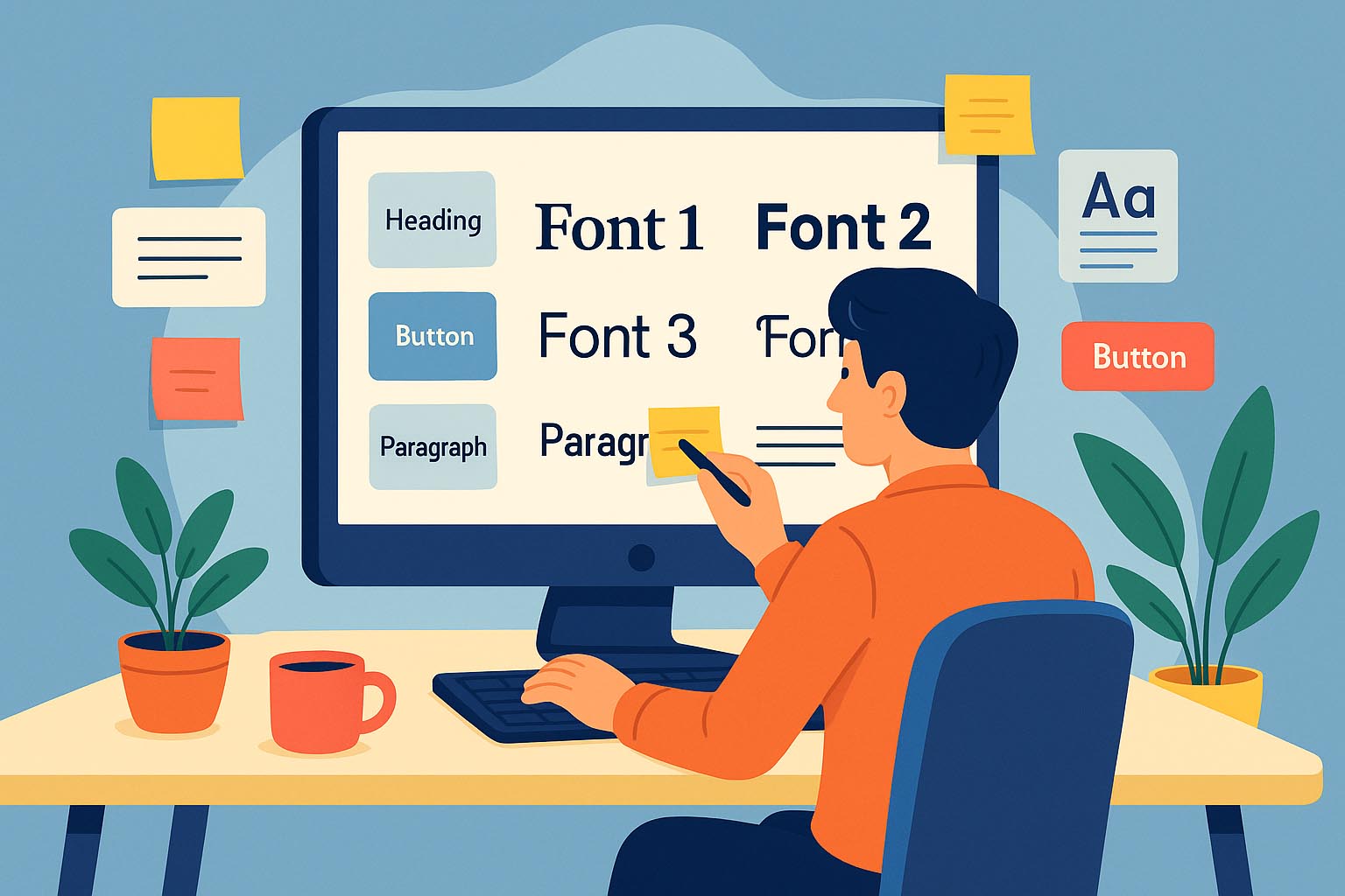
Chapter 1: Why Font Selection Matters in Digital Design
Every font has a personality. It whispers (or screams) something about your product before a single line of code runs or a button gets clicked.
A well-chosen font can:
- Enhance readability and user comfort
- Reinforce your brand tone
- Improve accessibility
- Establish credibility
- Guide user attention
Meanwhile, poor font decisions can make your app feel amateurish, untrustworthy, or simply unpleasant to use.
Chapter 2: Understand the Core Function of Your Product
Before diving into font libraries, ask:
“What is the primary function of my product?”
Are you building:
- A news or reading app? (Prioritize readability)
- A social platform? (Emphasize friendly, open typography)
- A fintech dashboard? (Go for clarity and trust)
- A fashion marketplace? (Elegance and tone matter)
- A productivity tool? (Neutral and efficient fonts win)
Let your product’s purpose shape the direction of your font choices.
Chapter 3: Match Your Font Style to Your Brand Voice
Fonts are visual voices. The wrong voice creates dissonance.
| Brand Tone | Ideal Font Type |
|---|---|
| Professional | Serif, geometric sans |
| Friendly/Casual | Rounded sans-serif |
| Bold/Rebellious | Display fonts, custom |
| Elegant/Luxury | High-contrast serif |
| Minimalist | Neutral sans-serif |
| Fun/Creative | Handwritten or display |
If your UI says “friendly,” but your font screams “corporate,” users will sense the mismatch—even if they can’t explain it.
Chapter 4: Choose the Right Typeface Category
Let’s break down the most common typeface styles and when to use them in digital products:
1. Sans-Serif Fonts
- Examples: Roboto, Open Sans, Helvetica, Inter
- Use For: Web & mobile apps, dashboards, clean UIs
- Why: High legibility, modern, neutral
2. Serif Fonts
- Examples: Merriweather, Georgia, Lora
- Use For: Blogs, editorial platforms, long reads
- Why: Adds a touch of tradition, great for body text
3. Display Fonts
- Examples: Bebas Neue, Playfair Display, Blackletter
- Use For: Logos, headlines, landing page highlights
- Why: Attention-grabbing, expressive (but not for body copy)
4. Handwritten or Script Fonts
- Examples: Pacifico, Dancing Script, Sacramento
- Use For: Branding, playful UI, personal touches
- Why: Adds personality—but use sparingly
5. Monospaced Fonts
- Examples: Source Code Pro, Courier New, Consolas
- Use For: Developer tools, coding apps
- Why: Aligns with the technical tone and improves scannability
Chapter 5: Prioritize Readability and Accessibility
Even the most beautiful font is useless if users struggle to read it. In UX, form follows function.
Readability Factors to Watch:
- x-height: Taller x-heights are easier to read on screens
- Letter spacing: Avoid overly tight or loose kerning
- Weight: Choose weights that maintain clarity at small sizes
- Contrast: Ensure enough contrast between text and background
- Line height: Use generous line spacing for long paragraphs
Pro Tip: Test fonts on real devices at small sizes, not just your retina MacBook screen.
Chapter 6: Consider Technical Constraints
Not all fonts perform equally in digital environments.
✅ Web-Safe Fonts — Load fast, compatible across devices
✅ Variable Fonts — One file, many styles (great for performance)
✅ Google Fonts — Easy to implement, widely supported
❌ Overly complex fonts — May render poorly on low-end devices
❌ Too many fonts — Slows load times and confuses the interface
Font Loading Tips:
- Limit to 2–3 font families
- Use only necessary weights/styles
- Implement
font-display: swapfor better perceived speed
Chapter 7: Don’t Forget Multilingual Support
If your digital product will be used globally, test your font with:
- Non-Latin scripts (e.g., Arabic, Thai, Cyrillic)
- Accented characters (é, ñ, ø, etc.)
- Font fallback systems
Choose fonts with extensive Unicode coverage to ensure your UI doesn’t fall apart in other languages.
Chapter 8: Establish a Font System
Just like a color palette or component library, fonts need structure.
A solid typography system includes:
- Heading styles (H1 to H6) with proper hierarchy
- Body text (for readability)
- Captions & labels (small but legible)
- Buttons & UI elements (bold or semi-bold for clickables)
Sample Hierarchy:
H1 – 32px, Bold
H2 – 24px, Semi-bold
Body – 16px, Regular
Caption – 12px, Light
Apply consistent spacing, weights, and sizes across the board. This builds visual trust.
Chapter 9: Test, Iterate, Repeat
Great font choices don’t happen in a vacuum. User testing is essential.
✅ Conduct A/B tests with different font pairings
✅ Observe user behavior (scrolling, reading time, drop-off rates)
✅ Ask for qualitative feedback (“Did the app feel modern? Friendly?”)
Fonts influence emotion and usability—test both.
Chapter 10: Best Font Pairings for Digital Products
Some font combos just work. Here are reliable pairings:
| Heading Font | Body Font | Use Case |
|---|---|---|
| Playfair Display | Open Sans | Editorial websites |
| Roboto Slab | Roboto | Tech/productivity apps |
| Montserrat Bold | Lato | SaaS dashboards |
| Abril Fatface | Source Sans Pro | Marketing pages |
| Raleway | Merriweather | Portfolio sites |
The key: Balance personality and functionality.
Conclusion: Your Font is Your First Impression
Fonts are silent brand ambassadors. They carry tone, intention, and function—all without saying a word.
So take time. Choose wisely. Test often.
In a world of fast scrolls and short attention spans, the right font won’t just be seen. It’ll be felt.